Wednesday, November 2, 2016

It's Halloween!

Photoshop Aspects

To create this Halloween themed website, we first made design elements that would not be possible with Dreamweaver. These consisted of the gradient background, the animated header, and a little animated pumpkin. the animations were a nice little throwback to e9, because even though I'm not taking an animation class, I really enjoyed animation itself. The background was made using the gradient tool constrained to vertical use and made small so it could be perfectly repeating. The animated title was made using the font tool (and I found this awesome font on DaFont!) and the color tools. That's it. The beauty is in the simplicity. The pumpkin was a little more complicated, drawing some aspects from graphic design and animation to create a little animated image with the illusion that a candle is flickering inside it. Overall the graphic design and animation aspects were a fun change of pace in this class.

Dreamweaver Aspects

This project was the first time I had ever used an iFrame, but it's fairly useful. It is a good way to insert other websites without taking the user off of the current one. I linked multiple websites, including Halloween Safety, History, and some Scary Movies. This was the only real big difference in this project, but it was a fun challenge nonetheless. 

Friday, October 7, 2016

Raccoons and Berries and Postcards Oh My

Foreword

Recently, my class and I designed raccoons using Illustrator, a template, and our imagination. I typically use Photoshop if I want to do a personal project, so it was a nice change to use a different program. I found that I enjoyed Illustrator much more than I did last year, and with the skills I have learned recently I hope to use it more often at home.

Raccoon with Leaves and Berries

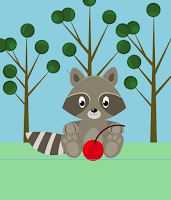
My first experience with the raccoon was with this introductory project, in which we were given a template to make the raccoon itself, and then freedom to do what we wanted with the background and accessories. Making it was not very difficult, with only simple shapes and colors to deal with. Originally, pathfinder was not working properly for me, and I wasn't able to remove some shapes from the final design, but I worked through it, and finished the raccoon. The background and accessories gave us more freedom, even though a template was still used for reference. I used the berry template to make berries, and then modified it to be leaves for the trees.

Postcard

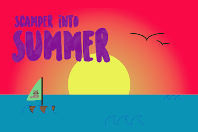
The postcard gave us a lot more freedom to do what we wanted, with the only guideline being: use the raccoon in some way and scan in text. I enjoyed scanning in my own handwritten text, and because my handwriting is not the best, I used the light board and traced over a font I printed off. This was fun because it gave me my own handwritten flare and taught me how to remove the background in order to put it on the postcard. Making the card itself was nice because it gave me complete control over what I wanted to do with the project. All in all, I enjoyed this project and how much of it was up to me. 

Saturday, October 1, 2016

Raven vs. Crow

New Beginnings

This project was fun for me because it was the first bit of freedom we received. We were given just a bit of instruction and trusted to figure the rest out. I enjoyed working with the divs and editing the pictures. I wish that I had a bit more time to work on it, because it was kind of challenging, but I doubt it would have made much of a difference because this was a step into dreamweaver. I enjoyed working with Dreamweaver, because I have done work with it before, and I really like the new and improved CSS menus.

Tuesday, September 20, 2016

Hours d'Oeuvres

Out of the Blue:


For this project, we experimented with color values to make specific combinations of red, green, and blue. They are arranged with a six number (or letter) pattern that looks like this: #RRGGBB. Certain combinations make certain colors, with the higher the value equalling darker colors, an vice versa. They used a unique system that placed values on a range from 0-15, much like how we normally use the 0-9 values. Values 10-15 are represented by a-f respectively. So, for example, #000000 would turn out black, and #FFFFFF would turn out white.


Fontastic

Our goal with this project was to figure out what fonts could be viewed by virtually all computers, as well as be able to name and utatlize all of them. This is necessary because even if someone were to build a website around a font that another computer may not process, it will not look the same. These, however, can be view by all, and therefore are 'web safe.' There are two categories: serif and sans-serif. The serifs tend to look more formal, and include Times New Roman, Georgia, and Courier New. The sans-serif fonts have a more casual look (including one that is arguably TOO casual), and include Arial, Verdana, Tacoma, Trebuchet MS, and the ever popular Comic Sans MS.

Monday, September 12, 2016

Photoshop Reflection

What I Learned

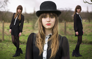
In just this short amount of time my knowledge of Photoshop has increased tenfold. I have learned new ways to remove small details from images, or layer details on top of the original for a more complete look. The first few little projects were fairly simple, but as time went on they got progressively more difficult. The collage ended this little list of projects, and was a good test of skill as it incorporated the skills learned prior.

Key Tools

First off, we used the Content Aware Fill. It is rather situational, but can save the user from doing too much work if used correctly. The Patch Tool was next, and we learned how to remove a graphic from a t-shirt. This can be used in large areas that can be fixed with a similar space. Clone Stamp and Healing Brush was next, and even though I knew how to use them prior, this project helped me refine my skills, especially using the Clone Stamp. The Spot Healing Brush proved to be a very useful tool that could do what would take a user a lot of time very quickly, and has less room for error than the Content Aware Fill tool. I used all of these for the last project, the portrait collage, which was the final step in mastering these tools.

Reflection

The tool that I enjoyed using the most was the Spot Healing Brush, which did so much for me with so little effort. It could make the sky the correct shade of blue, remove a tree limb, or fix a fence post. My strength was using the tools in somewhat different ways but still getting the same result, only easier. My weakness was taking a lot of time to fix things that I thought were not perfect because of how much of a perfectionist I am, so it took me a bit more time than others because I wanted perfect results. I would spend even more time working on them to make them exactly perfect if I was to do something differently, but otherwise I was very satisfied with my work. I would same methods to achieve the same results. I really enjoyed doing this little group of projects and I am so satisfied with my results. I like Photoshop a lot and I am always looking for new ways to use it, because I have access to it at home, so I use it in my free time.

Monday, August 29, 2016

Let's Go Way Back

Popular Sites: Past and Now

eBay

Before
After
The difference between both the old eBay and the new eBay is striking. There were a lot more links and a lot less pictures. New eBay looks a lot more uniform and doesn't have such a crazy color scheme. The old eBay is super cluttered and in my opinion looks... Not the best. I kind of like the crazy logo better though.


YouTube

Before
After
Another theme I'm noticing with the older websites is that they're not as wide as newer ones. Is this because of the difference in monitor size, or another reason? As well as with eBay, older Youtube looks way more cluttered, and has all its tabs on the top instead of on the sides. The logo isn't much different, but the layout is. There are also some contests, and YouTube doesn't really host any more now.


Before
Twenty One Pilots

I chose the Twenty One Pilots website as my last one because it was cool to see the progression of their website as the year went by and they got more popular. I enjoyed them before the Blurryface album (which was the one that made them famous) and it was pretty different before then. I like the older website better actually, cause I liked their red and blue color scheme and favor it over their red and black one.

After


Codes: Then and Now

eBay

Before

For eBay, the main thing that stands out is the code that spells out eBay in the newer website, which is a cool easter egg from the designers. There was a lot of code for the old eBay, which is understandable because there were many different aspects to the old website. The new one looks much cleaner and is shown in the code.


After


YouTube

Before
YouTube's code is drastically different to what it was. In the current version of YouTube, there is so much code the browser lagged trying to pull it up. That's understandable, because videos and formatting them takes up a lot of space. In the old version, there wasn't so much on the home screen so it was maybe a fourth of the length it is now. 

After


Before


Twenty One Pilots 

On this website, there wasn't much difference with the code. There are more pictures and the code reflects that, but there isn't a drastic difference like with YouTube or eBay. It's still interesting to look at them side by side, though. The length is also very similar, unlike YouTube.
After

Friday, May 13, 2016

How the GYRs Turned

My group was named GYR, and our product was the GYR breathalyzer. The team was very technically capable, and got all of our work done on time. Most of us got along very well, but one person really prevented us from clicking as well as we could have if they were not there. That one person held back our team at times by saying that they didn't like any other ideas we presented, but not giving any alternatives. With the next group project, I won't take on so much work, because it really gave me that 'everything has to be totally perfect' mentality that I really dislike having. I think that all of our work was really solid, but I'd maybe work for a bit longer on our presentation. Technical difficulties are great, aren't they? I worked on the final animation, made the whole website, and made the ad. All in all, I really liked this project, and I would do one similar to it in a heartbeat.