So What Is It?
In this day and age, we browse the internet across many different devices with varying screen widths. The amount of people viewing websites on mobile devices is increasing, so now it's important to account for both desktop and mobile users. Without the using responsive design, it can be hard to design a site that looks good across all devices. This is the goal of responsive design. Responsive design is when the website you're viewing adjusts to the screen size in order to look good across devices. The most efficient way to do this is by using media queries. Media queries are used to apply certain CSS styles only when the viewing width of the page fits within the parameters of the media query. In order to create a responsive design, you have to watch for breakpoints. You can find breakpoints by slowly decreasing the width of your window until the elements on the page become dysfunctional. This is where you insert a media query. You can make a website responsive by fixing these breakpoints.My Example Site
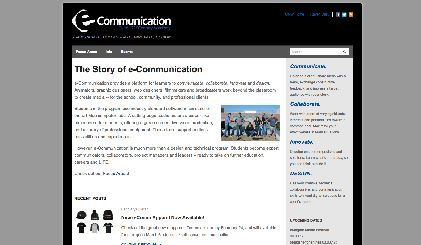 |
At full screen, the eComm site has a lot of information. This makes sense because there is a lot of room for this information.
|
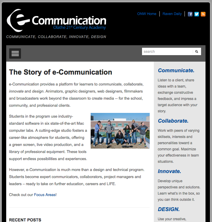 |
| However, when the width is decreased, the navbar reduces to a hamburger menu to reduce clutter. |
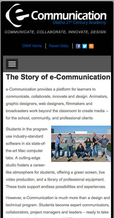 |
| At the smallest width, the sidebar changes position in order to make room for the article. |