Thursday, December 17, 2015
The Winchester
For this project, we put our Sketchup knowledge to the test. We followed a blueprint to make a house of the exact size and almost exact placement of windows and doors. I also added vegetation and a driveway to make change it up a bit. Making the roof was the most fun and kind of challenging, but I also really liked making the windows. We also made an animation, which is showcased in the video. Sketchup did most of the work, we just had to set key frames and the rest of the work was done for us. It was great changing the colors and adding little changes to make this house my own; that was definitely my favorite part. All in all, I loved this final project.
Webpage


Wednesday, December 2, 2015
In the Doghouse
 With this SketchUp project. we used a base, like a blueprint for a building. We used exact measurements to make the doghouses identical, save for the colors and the little accessories that I added in, namely the dog and the bowl. I likes having the freedom to do whatever I wanted with the last project, but I really like SketchUp, so it was still fun.
Bord och Stol
 For a while now, we've been using the program SketchUp to create 3D models of things. For this project, we created a table and chairs, and I modeled mind off of a table at a restaurant or bar stools. I used the Follow Me tool to make the corners not so sharp. and made the chairs all components and rotated them so that they would all be exactly the same. This was a really fun project!
Friday, November 20, 2015
Sketchy

Video Killed the Radio Star
Using our ten words that we chose for ourselves at the beginning of the year, we created a video style animation with Photoshop, instead of a frame by frame animation. The result is a smooth animation with little work involved, instead of those time-consuming frame animations.
ArcFire

Monday, November 2, 2015
Squash and Stretch

Wednesday, October 28, 2015
If you sketched of all my worst qualities, it would make quite a poor trait.
 My personality type is INTJ, or Introverted, Intuitive, Thinker, and Judging. On all of the sites that I have looked at, INTJs are considered to be intelligent, albeit a bit stiff, people. They seem to go through life like a giant chess game, strategizing their next move at every step. INJTs tend to have a natural thirst for knowledge from an early age. They also usually fly solo, not working in groups unless they have to. Some famous people that share my type are Albert Einstein, Sir Isaac Newton, and Stephen Hawking. Some fictional characters that are based off of INTJs are Sherlock Holmes and Moriarty, Hannibal, and Walter White.
 I think my type is pretty spot on, really. I don't tend to spend time with people unless I'm really comfortable with them, and I'm pretty curious about the world and how it works. I really relate to a lot of the things described on the websites, because a lot of it say that INTJs don't tend to waste their time on things that they consider to be unimportant.That's pretty much me. Something that maybe isn't me so much is what the websites say about the confidence of people with my type. My confidence isn't really my strong suit, and I tend to doubt myself a little bit. Other than that, I'm pretty in tune with my type. I kind of knew these things about myself, but hearing that other people are the same way is really nice.
When I'm on a team, I generally take a leadership role, an info checking role, or a researcher. Unless it's online, in which I usually make the project look appealing. I don't really like being told what to do, so unless I'm in a leadership role, I tend to do my own thing and then report back when I'm finished. I think in the past a lot of people thought I was arrogant and a loner, which to be honest is kind of true... But I don't mean to be those ways, really.
 We took the Lion, Otter, Golden Retriever, Beaver test, and I came out as a Lion. A leader that doesn't like to be told no.... Seems pretty spot on. Some of my stenght would be keeping on task, leading, and general strength, but my arrogance could hold me back. This also matches up with my MBTI personality pretty well.
Monday, October 19, 2015
"They loved your GPA, then they saw your Tweets"
Summary
This article is a warning. "Watch what you say!" Colleges look at applying students' social media as an insight to their life ad what they're like. There are people who scour the web for your social media to see if you made bad decisions on it, and if you did, then you most likely will get penalized for it. This is especially true if your grades aren't the best. Some students will change their content so that they can possibly cover it up, but it's best just to not post anything at all.Things That Surprised Me
It surprised me that colleges would say that they worry about the judgement of students that "spend their time on their mobile phone and makes such awful remarks." There could be students that spend time on their phones, perhaps more than usual, and still be good people. It also surprised me that 31% of college admissions officers said that they visited an applicant's Facebook or social media page. That surprised me because I didn't know so many people would do that. It also surprised me that someone would say that "deleting [stuff you don't want colleges to see] is kind of like joining two more clubs senior year to list on your application to try to make you seem more like the person they want at their schools." This surprised me because what this person said is really true, and I never thought of it that way before.Things That Confused Me
In the article, it talks about a senior who posted rude remarks about people on Twitter, and then it goes on to say, "perhaps she hadn't realized that colleges keep track of their social media mentions." How could she not know that? If your social media isn't private, anyone could see it. And even if it is private, people could still find ways to view it. The article also mentions someone who is a lawyer specializing in social media law' and I had no idea that those kind of lawyers existed. There also are guidance counsellors who help students scrub their social media clean, which I didn't know happened either.Impact
I don't really use social media, but if I did, I'd watch what I say. I don't see myself getting any soon, because I personally think it's a waste of time, but you never know. I think I'll just watch what I say online period.Thursday, October 8, 2015
My Photoshop Projects

For the first project, we worked on how to work on all separate layers, as we did with the text and compass ver the school. Also, we worked on how to use the opacity too, so that you could see the school behind the compass and text.

From a picture of a normal monarch butterfly, we added color to the wings by changing the hues and then added 'motion' to the wings using the clone stamp tool. For the longest time, I couldn't figure out the clone stamp tool, but after I used it correctly, it was easy.

Taking a picture of ONW, the same one as the first project, actually. We layered a text mask over it and adjusted the font size to make it stretch to the image, selecting the outside so that you can see the school in the letters. On the outside, we added a gradient. This one was really fun to use.

At first, this project was very difficult for me. Once I figured out how to remove the unwanted parts of the picture though, it was much easier. We used the clone stamp to remove the cars and light posts out of the picture and just show the school. Then we used the magic lasso to cut out a picture of the raven and follow the lines correctly, pasting it on the picture of ONW. Then we added pictures around the school on top and adjusting the opacity and shape of them. Then we cropped out some of the grass and added a border. It took a while, but I'm happy with the finished project.
Wednesday, October 7, 2015
Behind the Scenes of My Logo
 My logo is a pretty simple one, just a paper crane. It has lots of triangles in the design, that go along with the angular origami style. The triangle is an odd shape, and the orientation of it has a lot to do with how people look at it. My triangles go in all different directions, so there isn't a definite direction that you can say it goes, like left or right. The triangles just make one complete shape. I went with the black and white to keep things simple, but if I ever get to edit it, I think I'll add some paint splatters, to add some color.
Tuesday, October 6, 2015
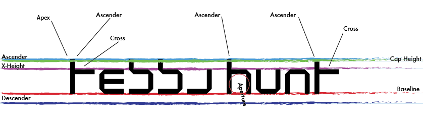
Anatomy of a Font

Friday, September 4, 2015
Fancy Color Wheel

Monday, August 24, 2015
What is Graphic Design?
 Graphic design is to use words and images to convey something to an other person, such as an idea or concept. It helps you communicate to people in a way that nothing else can. With my designs, I want to use humor and clever ideas to convey what I am saying. When you go and design your final product, it is important to do what you think is right before looking at what the people want or what the survey says. A little change to a sign make a huge difference if it is more eye catching and appealing. Graphic design is used in our every day life all the time and that is why it is important to me.
Subscribe to:
Comments (Atom)